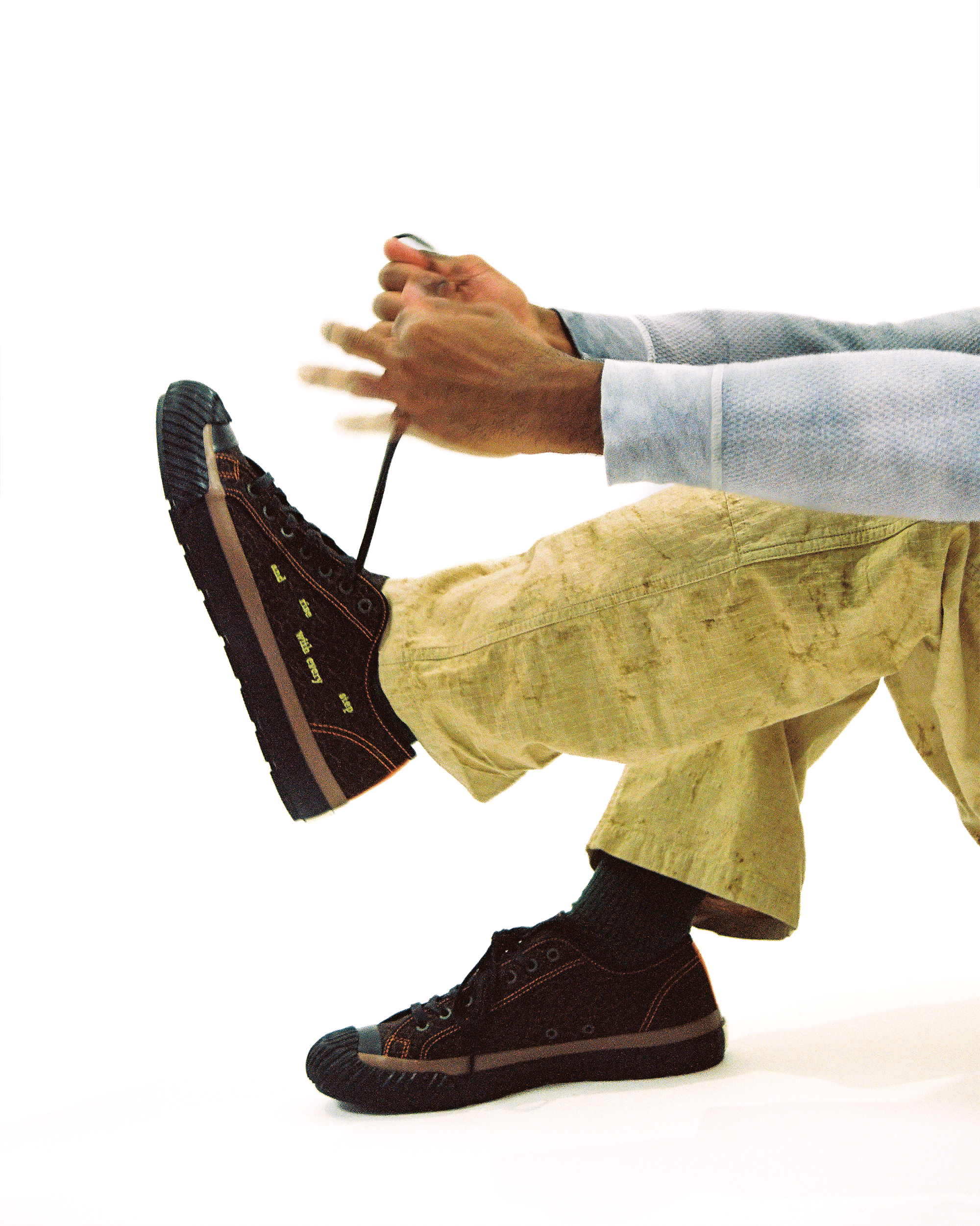
Nike - Merch Items
NIKE RUN CLUB A COMMUNITY-DRIVEN DROP THAT TURNS THE PACK INTO THE POINT

User-Centered Approach

Client
Nike
Year
2024
Duration
3 Months
role
Lead Designer
how i work
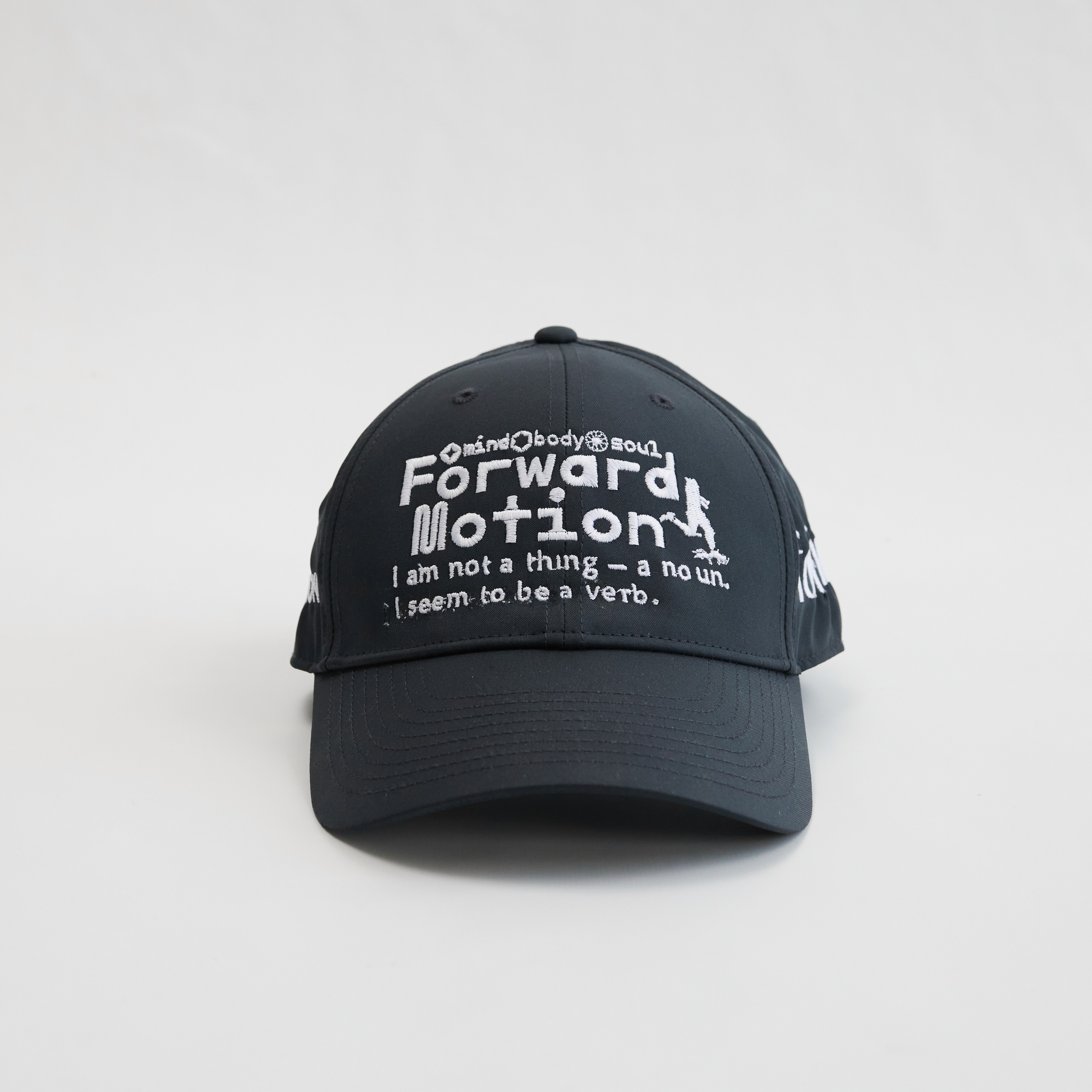
THIS NIKE MERCH COLLECTION WAS DESIGNED FOR A BRAND WITH DECADES OF ESTABLISHED VISUAL IDENTITY, WHERE EVERY DECISION HAD TO RESPECT EXISTING BRAND GUIDELINES WHILE STILL FEELING NEW. THE CHALLENGE WAS BALANCING NIKE'S STRICT BRAND RULES WITH SOMETHING THAT FELT FRESH AND DISTINCT, WITHOUT DRIFTING OUTSIDE WHAT THE BRAND ALLOWS. RATHER THAN CHASING A DIFFERENT DIRECTION FOR EACH PIECE, I FOCUSED ON ONE STRONG CONCEPT AND APPLIED IT CONSISTENTLY ACROSS THE FULL COLLECTION. OVER THREE MONTHS AS LEAD DESIGNER, THAT DISCIPLINE TURNED A SET OF INDIVIDUAL MERCH ITEMS INTO A COHESIVE LINE THAT FEELS BOTH UNMISTAKABLY NIKE AND UNMISTAKABLY NEW.

the challenge
Staying inside strict guidelines without blending in
Nike's brand system left very little room for error — every color, mark, and proportion had to clear internal approval, and one wrong move could sink the drop. The real risk wasn't creative, it was invisibility: merch that followed the rules so closely it disappeared into everything else Nike had already made.

the solution
We designed a modular dashboard system with intelligent data prioritization, allowing users to focus on what matters most. Clear visual hierarchy through typography, color, and spacing guides the eye naturally. Customizable widgets enable users to build their ideal workspace, while smart defaults ensure newcomers aren't overwhelmed. Real-time updates and interactive visualizations make data exploration engaging and insightful.